
Photo: Adobe
There are few things in the design world as deceptively simple and surprisingly influential as a color. Not a paint chip, not a shade of upholstery, not a trim option, but a cultural signal. That is what Pantone accidentally created in 1999 when they introduced the very first Color of the Year, a forward-looking tone meant to capture the emotional temperature of a global moment. Twenty-six years later, the announcement has become an annual design holiday. Architects watch it. Interior designers have strong opinions about it. Brands line up to partner around it. Homeowners absorb it whether they realize it or not.
And now we have Cloud Dancer, Pantone 11-4201. A soft, billowy white chosen for 2026, described as a calming influence in a frenetic society and a canvas for new beginnings. Which, frankly, feels spot on in a world where everyone is exhausted, overwhelmed and craving a clean surface to recalibrate on.
But this article isn’t just about Pantone’s pick. It is about why the Color of the Year matters so much today, especially in the technology-infused homes we build, design and integrate. And it is about the soft power of a neutral, why quiet colors still speak loudly, and how a single annual hue can ripple across industries ranging from paint to lighting to smart homes to fashion to hospitality.
To understand that influence, you have to understand Pantone’s story. To understand the opportunity, you have to understand Cloud Dancer. And to use it well, you need a plan.
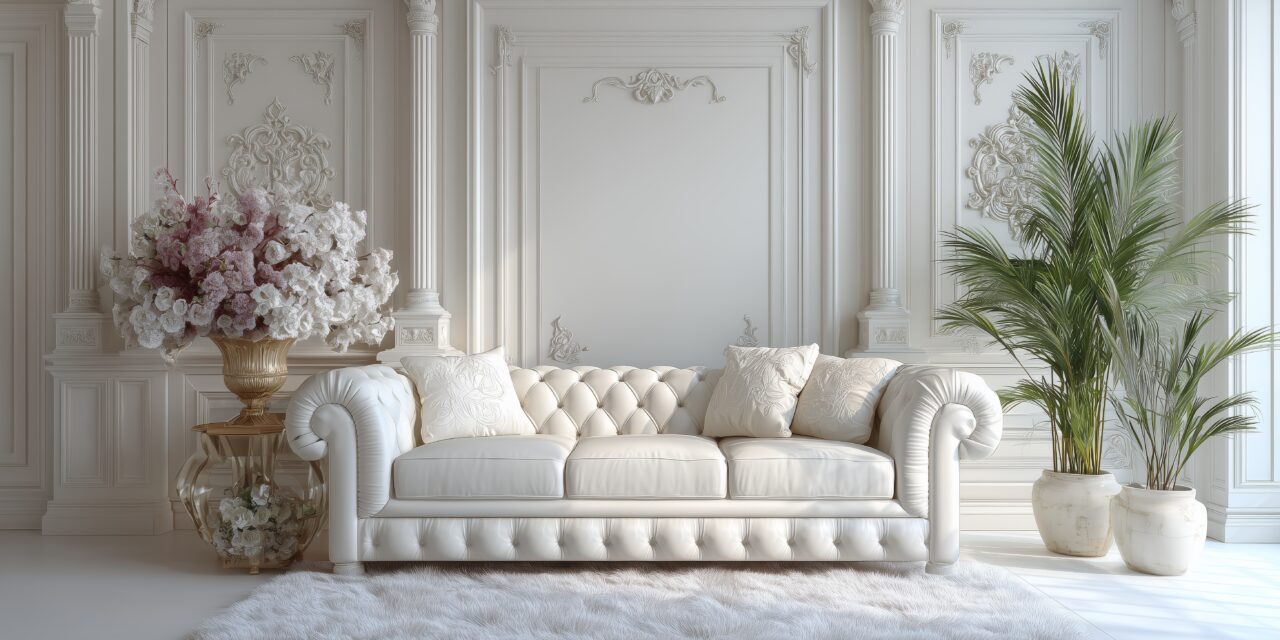
Cloud Dancer Pantone 11-4201
A soft, billow white chosen for 2026 described as a calming influence in a frentic society and a canvas for new beginnings.

THE ORIGIN STORY: HOW PANTONE ACCIDENTALLY CREATED A GLOBAL TREND
Pantone didn’t begin life as a tastemaker, it began as a printing problem. In the 1960s, Founder Lawrence Herbert created a unified language for color so designers, printers and manufacturers could finally stop arguing about what “red” meant. A very on-brand lesson here: shared language solves everything.
Decades later, Pantone had become the backbone of color communication across industries. But it wasn’t until 1999 that the company did something unexpected. With the world buzzing about Y2K and cultural anxiety sitting at a low hum, Pantone released its very first Color of the Year: Cerulean, a serene, sky-like blue meant to capture the collective desire for calm and optimism at the turn of the millennium.
Cerulean was more influential than Pantone could have predicted. It showed up on runways, in retail, in product design, and in interiors almost immediately. It even became famous for its cameo in The Devil Wears Prada, where Meryl Streep’s Miranda Priestly used it as the punchline in a lecture about how a single color can trickle through the entire fashion and consumer ecosystem.
What Pantone realized in that moment was that people weren’t just using color, they were responding to it. Emotionally. Culturally. Commercially. Cerulean proved that a color could say something about a global mood, and people would listen.
By the mid-2010s, Pantone’s Color of the Year wasn’t just an announcement; it was a cultural reset button. It reflected the mood, the anxieties, the aspirations. It captured what we wanted at that moment; serenity, connection, optimism, boldness, comfort and filtered it into a single symbolic hue.
Which brings us to Cloud Dancer.

WHY CLOUD DANCER AND WHY NOW
At first glance, Cloud Dancer looks like “just white.” Except it isn’t. Pantone doesn’t do “just” anything. Their color forecasting team travels, researches, listens, watches, and synthesizes global signals into a single, distilled tone each year.
Cloud Dancer isn’t a blank page. It is a pause. A reset. A deliberate choice to create calm in a year that will probably give us everything but.
In their press materials, Pantone describes Cloud Dancer as ethereal, balanced, and a space where creativity can breathe. That is a compelling description for a color, but a startlingly accurate description of what homeowners are craving too.
This is where the Technology Designer audience leans in. When homes become more complex with more systems, more interfaces, more lighting layers, and more automation, the design instinct isn’t “add more.” It is “make it feel effortless.” Calm is the new luxury. Clarity is the new performance metric.
Cloud Dancer, intentionally or not, is the palette version of that philosophy.
THE SOFT POWER OF A WHITE THAT ISN’T TRYING TO BE LOUD
Whites are deceptively technical. Ask any lighting designer: a wall painted white under a 2700K (Kelvin) fixture is not the same white at 3500K. System integrators know that display screens, projectors and even recessed trims behave differently near neutrals. Architects know material palettes shift dramatically depending on what their base neutral does to shadows, reflections and transitions.
Cloud Dancer is a white with warmth. It is not too cold. It is not too yellow. It is not sterile or beige. It is a grounding neutral that quietly enhances natural wood, stone, warm metals, textured fabrics, architectural lighting, and wellness-focused color temperatures.
For a smart-home environment, Cloud Dancer offers a stable backdrop that can hide technology when needed, showcase materials, reduce visual noise, balance layered lighting scenes, and serve as a neutral base for tunable-white strategies.
This is not a loud color competing with technology. It is a color that supports technology by making the environment feel coherent.

THE DESIGN AND TECHNOLOGY INTERSECTION: WHERE CLOUD DANCER ACTUALLY MATTERS
Here is the part the Pantone team may not have considered but the Technology Designer audience absolutely will.
Cloud Dancer’s influence can directly enhance material selection. Architects and designers can confidently pair Cloud Dancer with warm wood, porous stone, matte finishes and organic textiles. It is a neutral that refuses to flatten material and instead supports it.
It can guide lighting temperature strategies. Cloud Dancer becomes the reference point for interior lighting decisions. At 2700K, spaces feel warm and intimate. At 3000K, they stay balanced. At 3500K, Cloud Dancer reads crisp without becoming harsh. This adaptability makes it a strong anchor for residential systems that need to feel cohesive.
It informs visibility versus invisibility of technology. Cloud Dancer helps integrators decide when technology should disappear through white speakers, in-wall controls, or flush bezels, and when it should stand out through contrasting fixtures, art frames or sculptural luminaires.
In other words, Cloud Dancer is a collaboration tool. It is a shared design language between architect, lighting designer, interior designer and integrator. It is a bridge color that reduces friction in multi-discipline environments.
THE RIPPLE EFFECT: HOW BRANDS BRING PANTONE’S COLOR OF THE YEAR TO LIFE
Pantone’s partnerships help tell the story of the color’s intent. Cloud Dancer is no exception.
This year’s partner list ranges from Motorola to Joybird, from Mandarin Oriental to Monotype, from Play-Doh to Spotify, from 3M’s Post-it and Command brands to Pura home fragrance. These collaborations show how a single neutral tone can move across industries. Cloud Dancer can appear in a phone, a sofa, a spa treatment, a typeface, a toy, a playlist, and an everyday object like a hook or a notepad.
These partnerships matter because they reveal the versatility and emotional clarity of Cloud Dancer. They also act as signals. If major brands are aligning on the message of calm, clarity and creative breathing room, then homeowners will begin expecting those qualities in their physical spaces too.

ACTIONABLE WAYS DESIGNERS AND INTEGRATORS CAN USE CLOUD DANCER TODAY
Let’s bring this into practice.
Designers can build a materials palette anchored by Cloud Dancer, then layer warm woods, matte metals and soft textures. Integrators can use it as their lighting reference color, evaluating fixtures and scenes against Cloud Dancer swatches to ensure harmony. Teams can decide early in the project whether the technology should recede or stand out because Cloud Dancer provides a clear visual backdrop for either choice. It works beautifully in client presentations because the meaning of the color is instantly understood. And finally, it can serve as a shared reference point for multi-discipline teams, simplifying conversations and reducing misalignment.
LOOKING FORWARD: WHAT THIS COLOR SAYS ABOUT WHERE DESIGN IS HEADED
Pantone says Cloud Dancer symbolizes measured consideration, quiet reflection and a desire for contentment. Designers say whites like this create mental clarity. Integrators say neutrals simplify alignment and reduce visual noise. Architects say a soft, balanced white sets the emotional tone of a home. Homeowners say they want less chaos and more calm.
Whether they intended it or not, Pantone chose a color that aligns with one of the most important shifts happening in modern home design: the return to spaces that feel supportive, grounding and intelligently calming, even when the systems inside them are highly sophisticated.
Cloud Dancer is not flashy. It is not loud. It is not trying to be the main character.
But maybe that is the point.
In a world of louder, brighter and more complex everything, Pantone gave us a color that invites us to design and live with more intention.
CONCLUSION: A COLOR THAT QUIETLY HOLDS EVERYTHING TOGETHER
Cloud Dancer won’t dominate your projects. It will support them. It is a flexible, grounding neutral that stabilizes materials, lighting and technology. It is a reminder that calm is a design strategy. That clarity is a luxury. And that even in a fast-moving industry, sometimes the softest choices shape the strongest outcomes.
For designers, integrators, architects and collaborators across disciplines, Cloud Dancer offers an invitation: simplify, align, reset. And maybe that is exactly what 2026 needs.


